
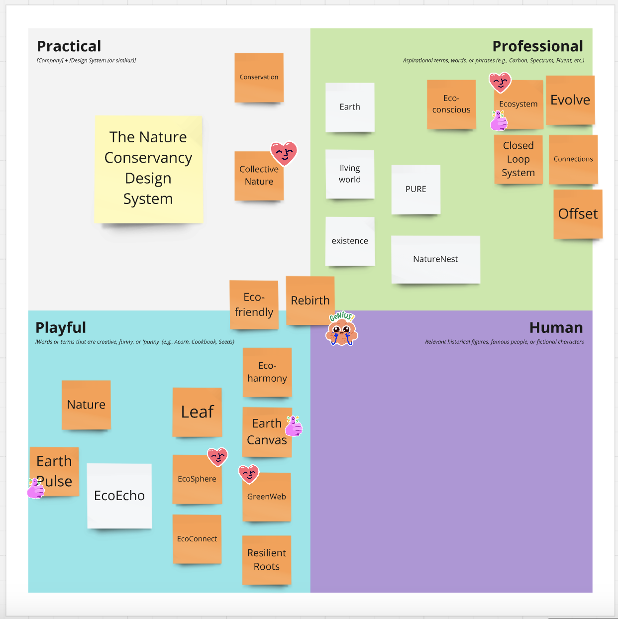
An Accessible Design System for The Nature Conservancy Website

The Nature Conservancy, a global leader in environmental conservation, utilizes its website to educate, engage, and inspire users to donate to their mission.
After conducting an interface audit, several redundancies and inconsistencies were revealed across the site.
For a large global, content-rich platform, these issues can hinder engagement, compromise accessibility, and weaken brand integrity.
A lack of a cohesive design system impairs operational efficiency, impacts collaboration, increases development time, and raises maintenance costs, negatively affecting performance and scalability.
To address these challenges, we developed Ecosystem, a unified and accessible design system that standardizes all design components and guidelines across The Nature Conservancy’s website.
Internal Users: Designers and developers in The Nature Conservancy.
External Users: Anyone in the public who wants utilize Ecosystem to develop their own websites.
Alya Zouaoui – MS Data Analytics & Visualization, Advanced Certificate in User Experience
Chu Yuan Chiu – MS Information Experience Design
Yeatasmin Shiropa – MS Information Experience Design
🔍 Conducted a Full Interface Audit – Independently deconstructed The Nature Conservancy’s site, identifying inconsistencies, accessibility gaps, and areas for design system improvement.
🎯 Defined & Articulated Design System Principles – Collaborated to establish the core principles guiding Ecosystem, ensuring clarity and alignment with usability, accessibility, and scalability goals.
🎨 Built the Entire Token System – Created a structured color, spacing, and layout system to maintain design consistency across all components.
🖋 Established the Typographic Hierarchy – Defined a clear system for font sizes, weights, and styles, ensuring consistency across the UI.
🎛️ Created All Component States & Interactions – Designed hover, focus, disabled, and active states, along with interactive elements like dropdowns and search.
⚙️ Mapped Correct Tokens to Every Component – Ensured proper light/dark mode integration and consistent application of tokens.
♿ Embedded WCAG Accessibility Standards – Implemented accessible color contrast, keyboard navigation, and typography.
📐 Refined Every Component Using Auto-Layout – Structured components for efficiency, flexibility, and easy updates.
📊 Generated Detailed Component Specs – Used Figma plugins to create structured documentation for developers.
📖 Redesigned & Rebuilt the Entire Documentation Site – Made the documentation clear, structured, and usable for both internal teams and external adopters.
🔄 Refined & Elevated Teammates’ Work – Reviewed and improved components to align with professional standards, proper token usage, and accessibility best practices.

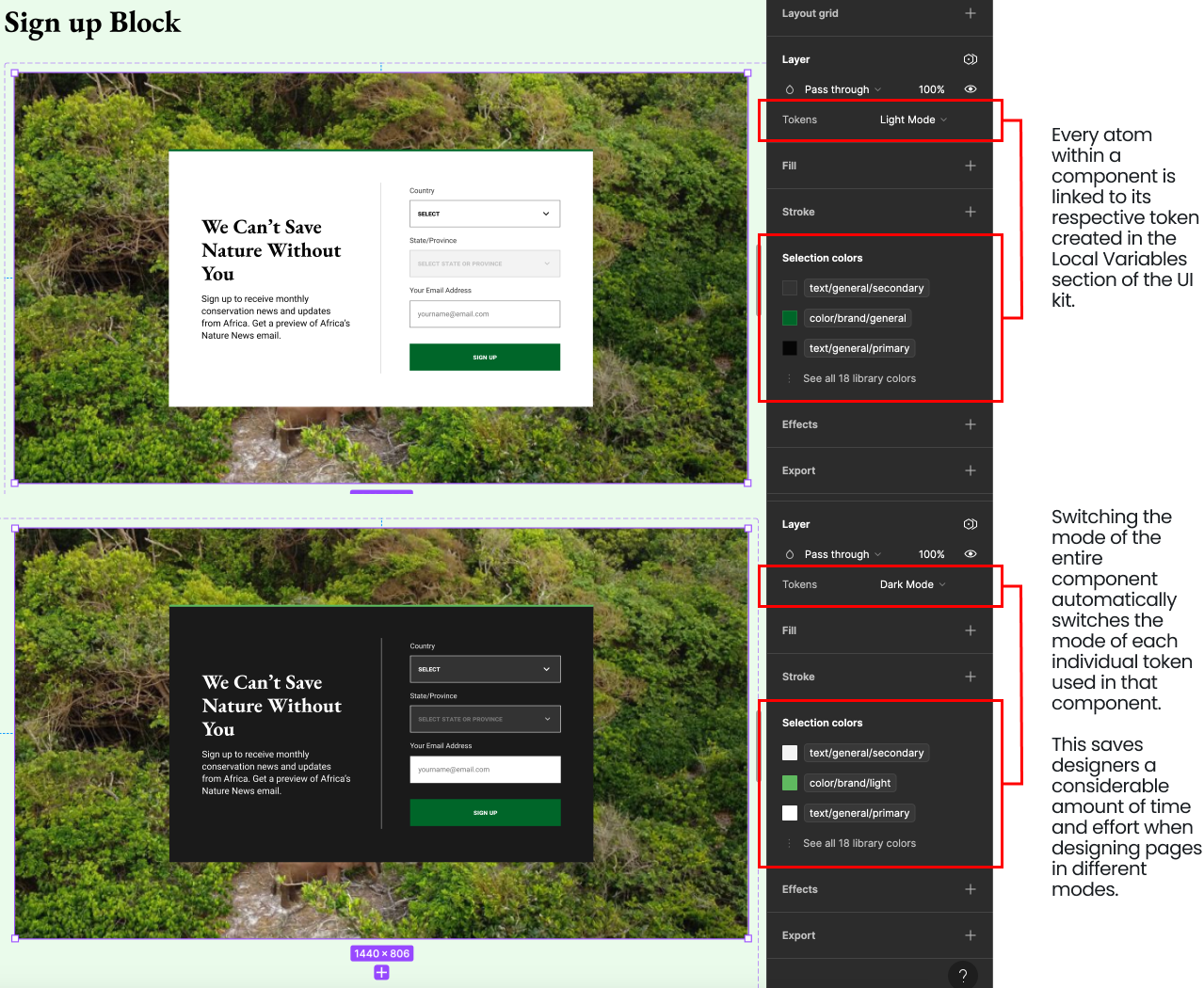
Ecosystem’s Figma UI Kit includes reusable, accessible components with built-in variants such as active, hover, and disabled states. Components are created using a comprehensive token system for both light and dark modes, ensuring consistency and enhancing accessibility across the site.

Ecosystem’s Documentation Site on Zeroheight provides clear, concise guidelines with visual examples to help effectively implement components in the UI kit and facilitate easy integration and maintenance of the design system.

This project exemplifies how a well-structured design system streamlines workflows, improves accessibility, and enhances collaboration. By building a comprehensive UI Kit and documentation site, Ecosystem has laid the foundation for scalable, inclusive, and efficient design practices within The Nature Conservancy and beyond.
Clear documentation and well-structured components ensure seamless adoption.
Bridges the gap between designers and developers, reducing errors and streamlining workflows for efficient implementation.
A structured token system enables global design updates, maintaining consistency with minimal effort.
Accessibility standards are embedded at every level, ensuring WCAG compliance and usability for all users.
As an open-source system, Ecosystem supports external teams in building their own sustainable, inclusive designs.
A centralized resource reduces redundancy, optimizes performance, and lowers maintenance costs.
In order to uncover issues in The Nature Conservancy’s current design system, it was crucial to understand how it’s structured. This involved deconstructing the website’s interface and categorizing its unique elements in a UI Inventory.
Analyzing the website’s interface in this manner provided valuable insights into recurring patterns, such as accessibility issues.
This comprehensive auditing process served as a foundation for understanding The Nature Conservancy’s current design landscape and informed the development of a cohesive and standardized design system tailored to its specific needs.

Various inconsistencies were identified in how components were utilized across different sections of the website, leading to a lack of cohesion.
While certain components recurred throughout the site, several discrepancies in size, color, and spacing were observed, indicating a need for standardization.
A consistent typographical hierarchy was notably absent, impacting readability, visual coherence, and communication of the organization's message.

The process of deconstructing the design system and creating a UI inventory was conducted individually. Before coming together to recreate the design system as a team, it was crucial to communicate my observations and challenges. This fostered a collaborative discussion on how to tackle these issues, while also drawing inspiration from other design systems, such as The Goldman Sachs Design System, Google's Material Design, and Adobe's Spectrum, to enrich our new design systems framework.
Understanding the organization’s values and principles, as well as our own, allowed us to establish a common language and vision for our new design system.

Our clearly defined principles allowed us to work together as a team to solve design problems with consistency and a shared purpose.
Our design system fosters connectedness by ensuring that every component, guideline, and interaction seamlessly integrate together.
We prioritize simplicity to streamline the user experience, eliminating clutter and enhancing usability for efficient task completion.
Our bold design language instills trust and reliability, empowering users to navigate with assurance and strengthening brand loyalty.
We create memorable experiences that resonate emotionally, leaving a lasting impression of inspired and motivated users.
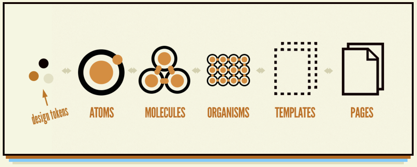
Brad Frost’s Atomic Design methodology bridges the gap between designers and developers by constructing components in a modular approach using a token system.
This approach not only promotes simplicity and consistency but also guarantees reliability, resulting in user experiences that are both clear and impactful.
By prioritizing reusable components that can be combined and repurposed, this enables the creation of cohesive and memorable interfaces that align with Ecosystem’s core design principles.
Tokens are the foundation of Ecosystem, transforming core visual attributes, or primitives—such as color and spacing—into reusable units. Ecosystem tokens are applied across all components to ensure a consistent and cohesive design throughout the website.
This system streamlines collaboration and simplifies updates—changing a single token automatically updates all related components, ensuring consistency and reducing errors during design iterations.

The token system is hierarchically structured and labeled according to specific component usage to increase the efficiency in locating and applying tokens to components.

Our documentation site ensures designers and developers can effectively apply the token system. It provides designers with best practices for using tokens in the Figma UI Kit and developers with structured JSON data and naming conventions for seamless implementation. This alignment streamlines collaboration and maintains consistency across the design system.
Ensuring tokens enforced a unified design while allowing for necessary customization.
Establishing a clear hierarchy to ensure every component had the correct token assignment.
Refining token names for clarity and ease of use across both design and development.
Integrating component variations directly into the UI Kit allows designers and developers to toggle between variations seamlessly, eliminating the need to recreate them from scratch.
To streamline the design process and maintain consistency, I embedded:
Designers can efficiently test and iterate, while developers can confidently implement components with predefined styles, reducing errors and maintaining alignment across teams.
To ensure the Ecosystem design system is intuitive and accessible for both internal teams and external users, we developed a comprehensive documentation site. Rather than existing as a separate entity, the documentation is deeply integrated into each component and design decision, guiding users at every step.

The documentation provides clear, structured guidance on:
This structured approach helps both internal teams and external contributors efficiently adopt and apply the design system.
Building a robust design system required meticulous attention to detail, problem-solving, and continuous iteration. Throughout this process, I addressed critical gaps, refined components to enhance usability, accessibility, and efficiency, and ensured seamless alignment between design and documentation.
The initial build had critical gaps in component states, missing tokens, and inconsistent labeling, requiring in-depth auditing and refinement.
Ensuring proper integration of interactions, states, and modes required extensive iteration to meet accessibility and usability standards.
Establishing a seamless connection between the Figma UI Kit and the Zeroheight documentation site ensured clarity for both internal and external users.
This project exemplifies how a well-structured design system streamlines workflows, improves accessibility, and enhances collaboration. By building a comprehensive UI Kit and documentation site, Ecosystem has laid the foundation for scalable, inclusive, and efficient design practices within The Nature Conservancy and beyond.
Through this experience, I strengthened my ability to lead, problem-solve, think systematically, and deliver high-quality design systems, leveraging research-driven, accessibility-focused solutions.
Every aspect was carefully justified and documented, aligning stakeholders and ensuring long-term sustainability.
Addressing inconsistencies and refining components was crucial for system-wide cohesion.
Embedded WCAG standards ensured usability across diverse user needs.
Effectively linking the UI Kit and documentation site created a streamlined experience for adopters.
This case study demonstrates my expertise in building scalable, accessible, and user-friendly design systems from the ground up.
While Ecosystem successfully enhances accessibility, consistency, and efficiency, further improvements could drive even greater impact: